American Bird Conservancy
We were hired to redesign the American Bird Conservancy website to enhance user experience and drive more donations.
The Ask
Redesign the American Bird Conservancy site to enhance user experience and drive more donations.
In collaboration with the American Bird Conservancy, I led the UX research phase of the website redesign project. Our aim was to enhance user experience, engagement, and accessibility for visitors to the site while aligning with the organization's mission and goals. Some of the key factors for the redesign were to elevate the organizations international work, enhance the navigational experience, and to drive more donations from the site.
The Process
Stakeholder Interviews
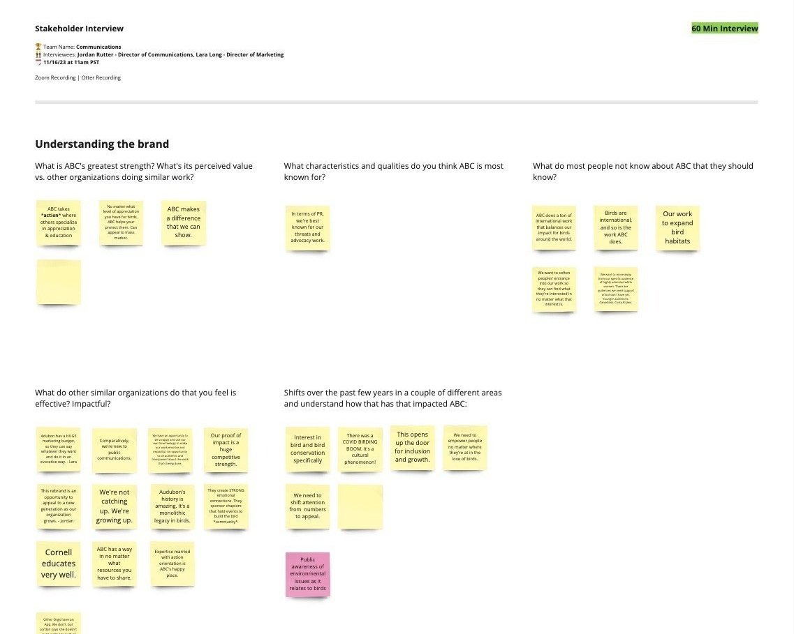
I conducted in-depth stakeholder interviews with 8 key representatives from the American Bird Conservancy to gain insights into their organizational objectives, target audience demographics, content priorities, and pain points with the current website. Through these interviews, we uncovered valuable perspectives that informed our design decisions moving forward.
Analytics Review
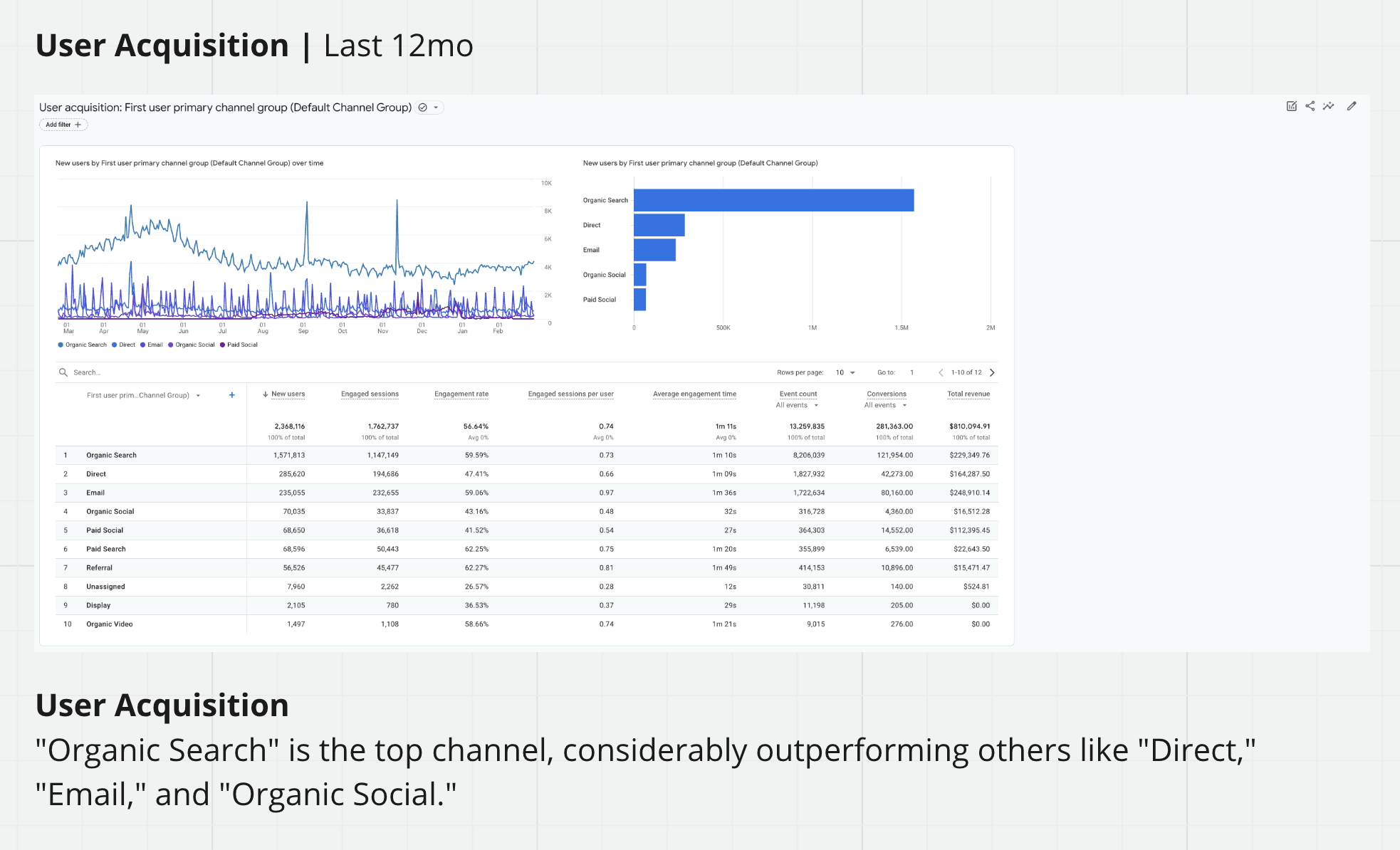
By examining the website analytics data, we gained a comprehensive understanding of user behavior, including popular pages, entry and exit points, and navigation patterns. This analysis helped us identify areas of the site that were underperforming or causing friction for users, informing our prioritization of improvements.
Usability Review
Through an internal usability review workshop, we identified pain points, obstacles, and areas of confusion within the current website interface. These insights allowed us to pinpoint specific areas for improvement and informed our iterative design process.
User Flows
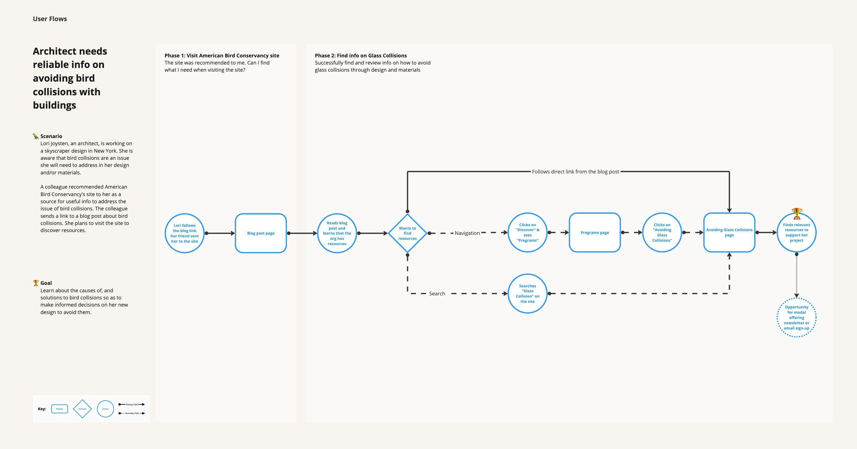
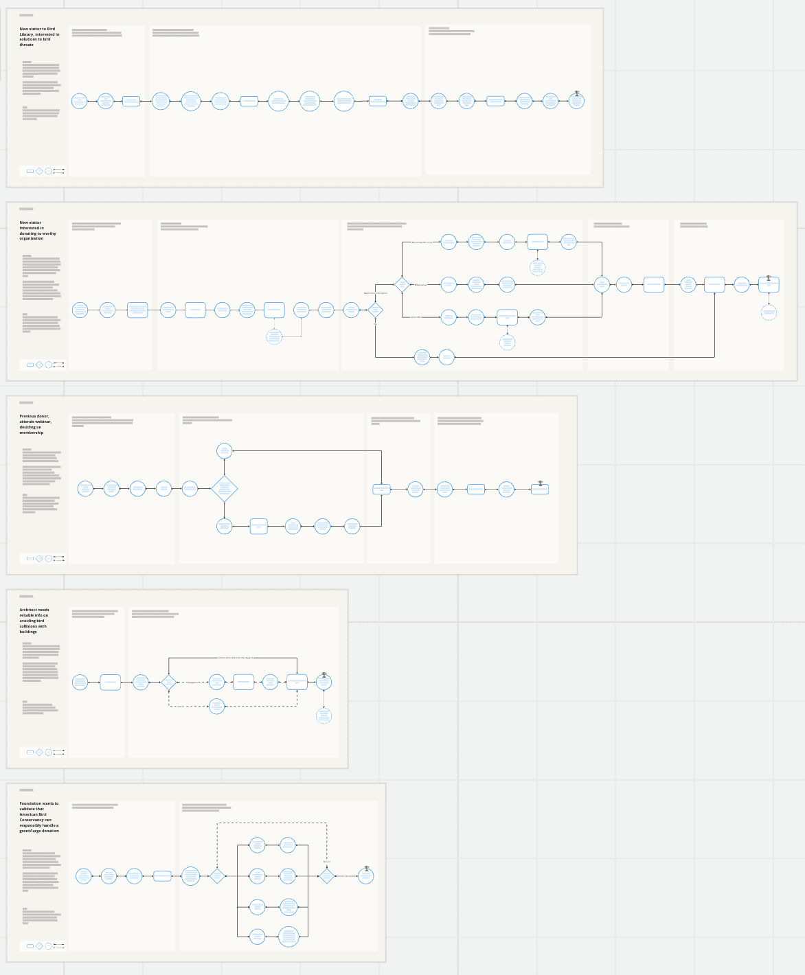
User flows were created based off of our core audiences to visualize the sequential steps users take to accomplish specific tasks or goals on the website. These user flow diagrams helped us identify potential pain points, decision points, and opportunities for optimization within the user journey.
Information Architecture
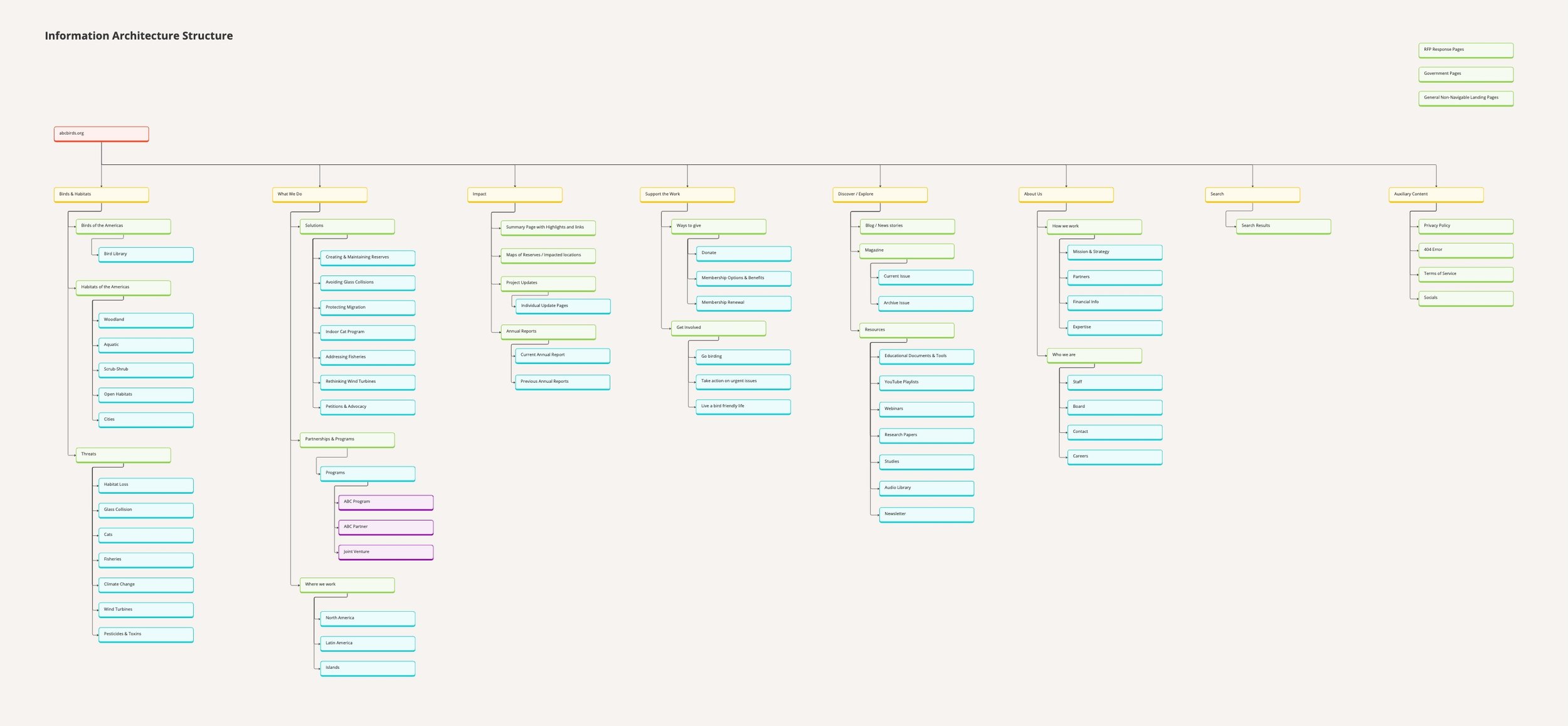
We developed a new information architecture framework to restructure the site's content hierarchy, navigation menus, and labeling systems. This process involved a high-level mapping out of content relationships, defining user pathways, and streamlining the overall user experience.
Content Strategy
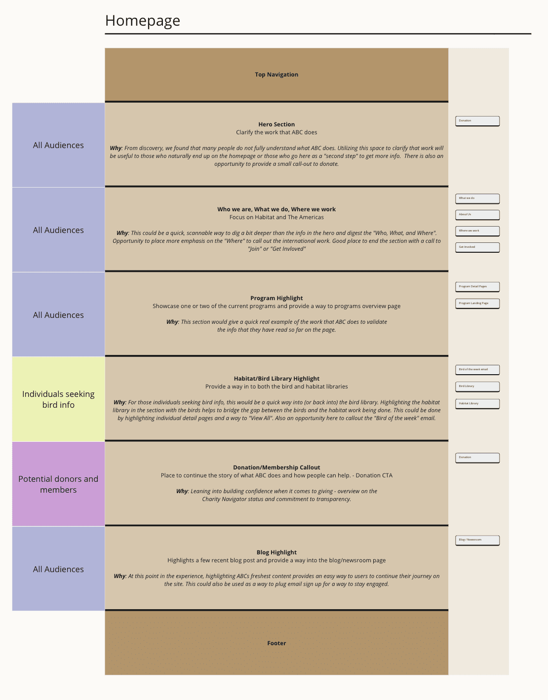
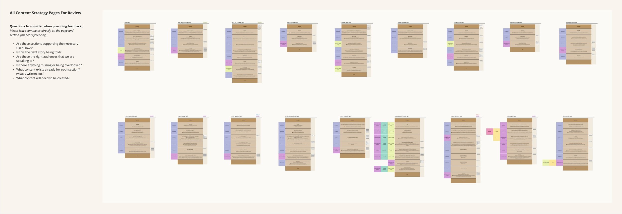
We developed a content strategy that involved creating section blocks for key pages to visualize how the story would be told on each page. These section blocks outlined the content hierarchy, messaging, and visual elements for each page, ensuring consistency and coherence across the website.
The Work
Stakeholder Interviews
During these interviews, we met with different members of the organization from the president to department directors.The themes were very similar, there was a distaste for the current “outdated” site. The site does not feel like an accurate representation of the current organization.
Analytics Review
A surprising finding from the analytics review was the amount of organic traffic that the blog pages bring in. After further investigation, we noticed a high bounce rate from these blog pages as well. Our recommendation was to rethink both the structure of these pages as well as the overall navigation of the site that may be keeping users from taking a “next step”
Usability Review
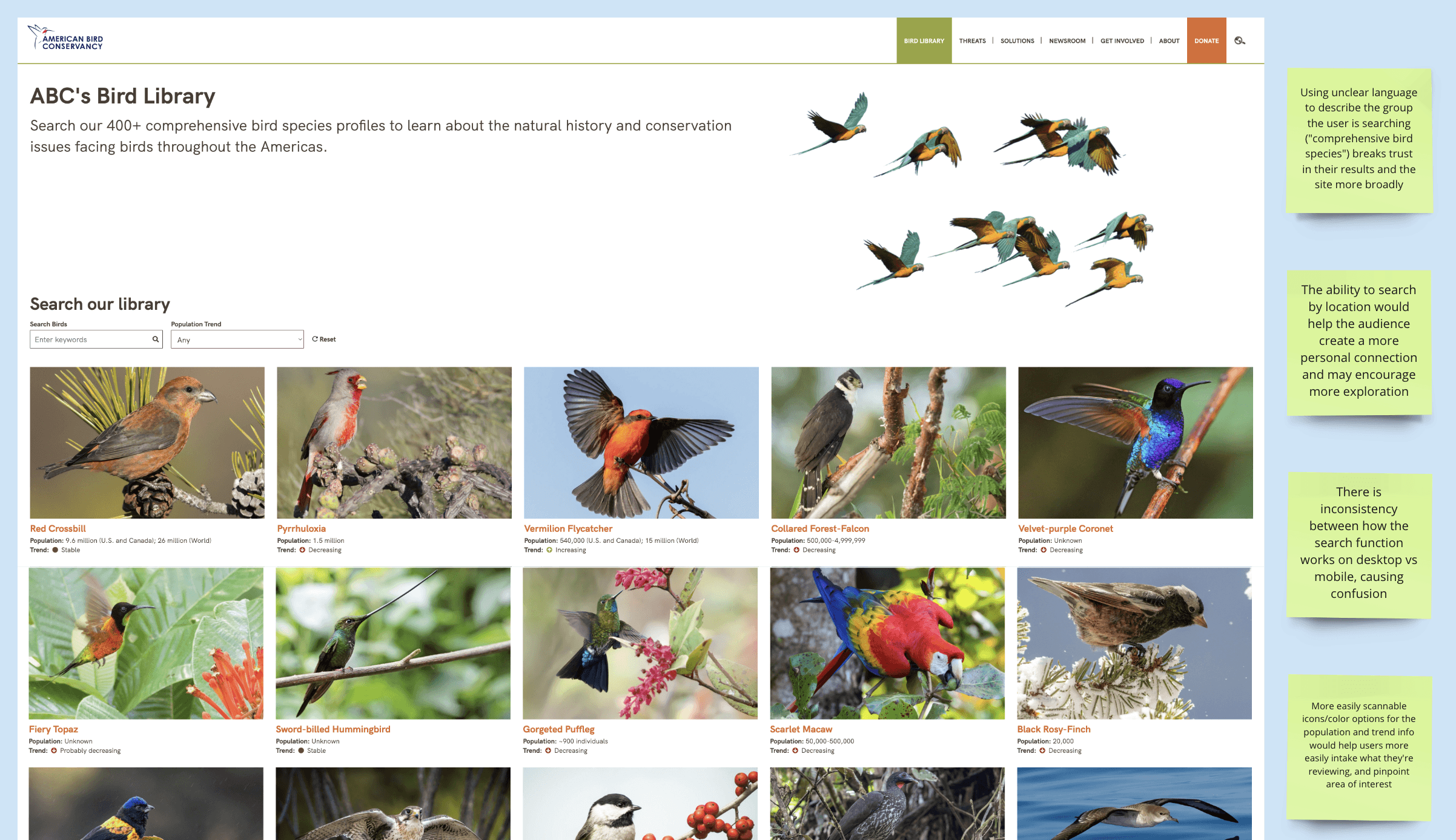
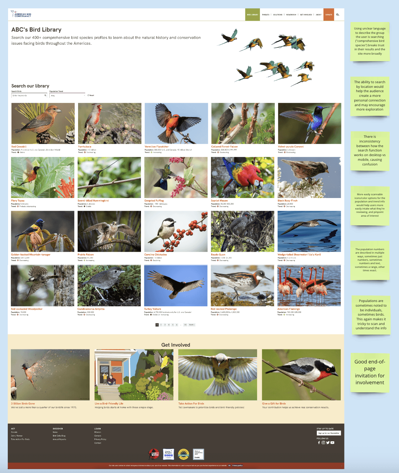
Through an internal usability workshop, we chose a few areas of the site that we wanted to check for overall usability and use of common heuristics.
This uncovered many opportunities to address things like consistency, page complexity, and content strategy with the client.
User Flows
Through a few rounds of iteration, we developed 5 user flows that represented some of the key journeys that our core audience members would take to complete their respective tasks on the site.
Information Architecture
Iterating on the information architecture involved several rounds of feedback and refinement.A pivotal moment came when we simplified the navigation menu based on stakeholder feedback, reducing clutter and improving find-ability of key content areas such as the blog content and their threat and solutions pages.
Content Strategy
For this approach to content strategy, we developed this template that goes section by section calling out the story that we want to tell on the page and why.
We also call out the individual audiences that each section speaks to as well as exemplifying the various “Calls to action” that could live within each section.
Conclusion
The UX phase of the American Bird Conservancy website redesign project was pivotal in laying the groundwork for a user-centered and impactful digital experience.
Through stakeholder interviews, analytics review, usability testing, content strategy development, and information architecture refinement, we gained invaluable insights into user needs, behaviors, and preferences. These insights not only informed our design decisions but also fostered a deeper understanding of the organization's mission and how best to communicate it to visitors.
As the team transitions into the next phase of wireframing and design, armed with a comprehensive understanding of our users and their journey, we are poised to create an intuitive, visually engaging, and purpose-driven website that effectively connects people with the conservation initiatives of the American Bird Conservancy.
