Zillow
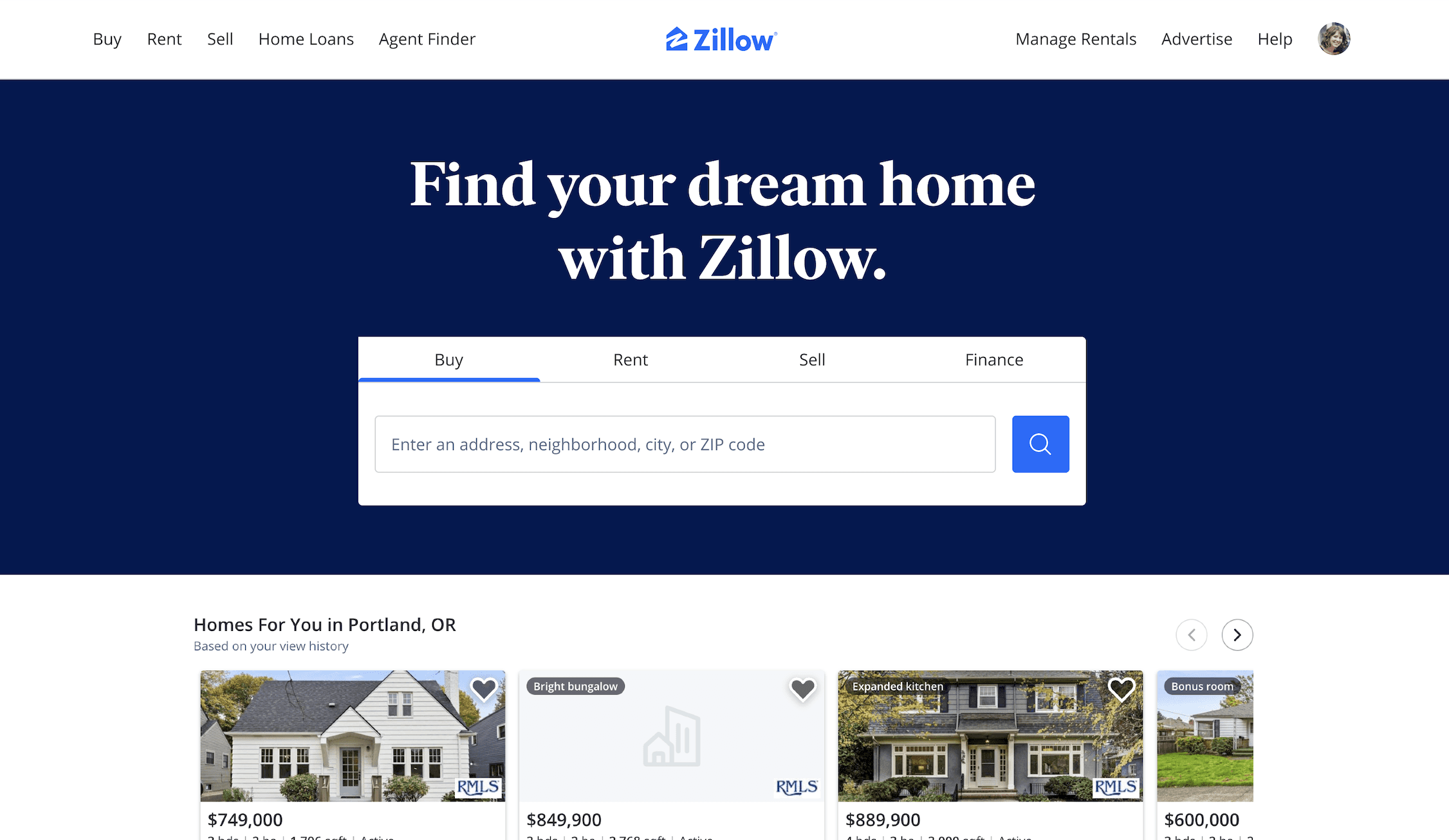
We were hired to explore a new homepage search experience that gets users to the solutions they need faster and with less effort.
The Ask
Design a homepage search experience that gets our users to the solutions they need faster and with less effort.
Zillow's current homepage search functionality lacks integration with both their rent and loan options, limiting users' ability to seamlessly explore properties while considering rent and financing options. Users often navigate between multiple platforms to gather information about rental properties and home loans, resulting in a fragmented and inefficient experience. How might we enhance Zillow's search bar to incorporate all of Zillows solutions, providing users with a comprehensive real estate solution in one platform?
The Process
Internal Research
Conducted usability testing with internal stakeholders to identify pain points and usability issues in the current search bar experience. Conducted stakeholder interviews to gather requirements, preferences, and expectations for integrating rent and loan options into the search bar. Analyzed research findings to uncover insights and inform the design process.
Design Exploration
Developed three distinct design options for integrating all solutions into Zillow's search bar, considering stakeholder feedback and usability testing insights. Created high-fidelity wireframes for each design option to visualize the proposed solutions. Presented the design options to stakeholders, providing rationale and insights behind each approach.
Stakeholder Engagement
Facilitated discussions and feedback sessions with stakeholders to gather input on the design options and address any concerns or questions. Guided stakeholders through the decision-making process to identify the preferred design option for further development.
The Work
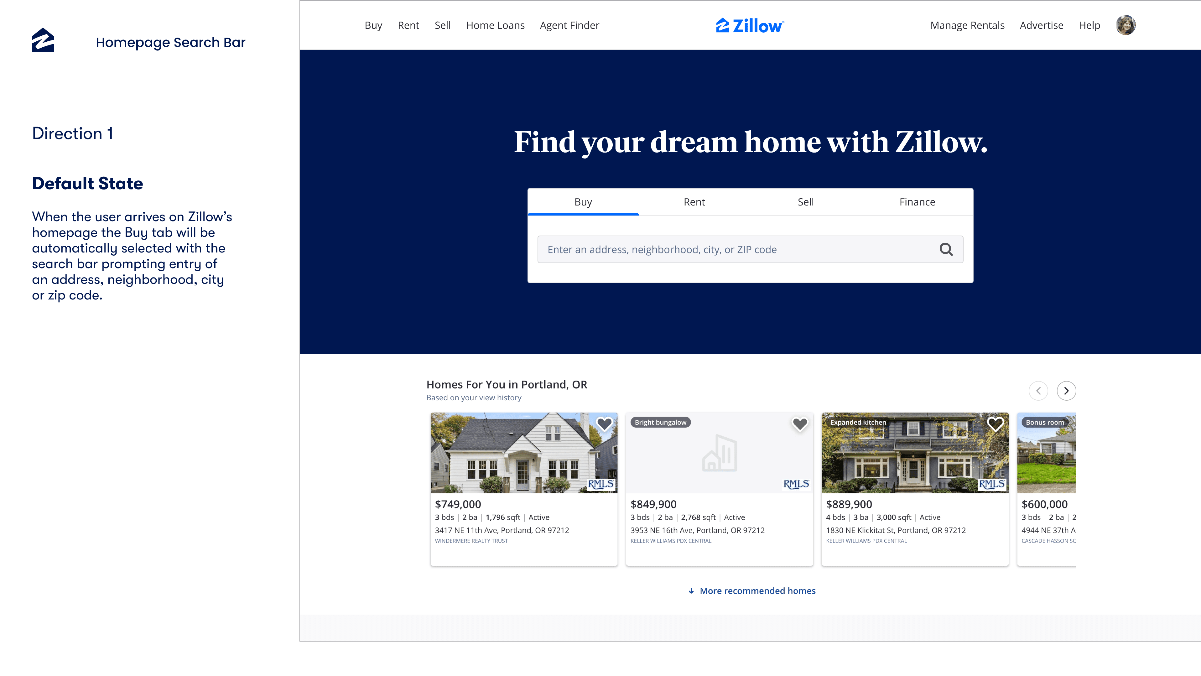
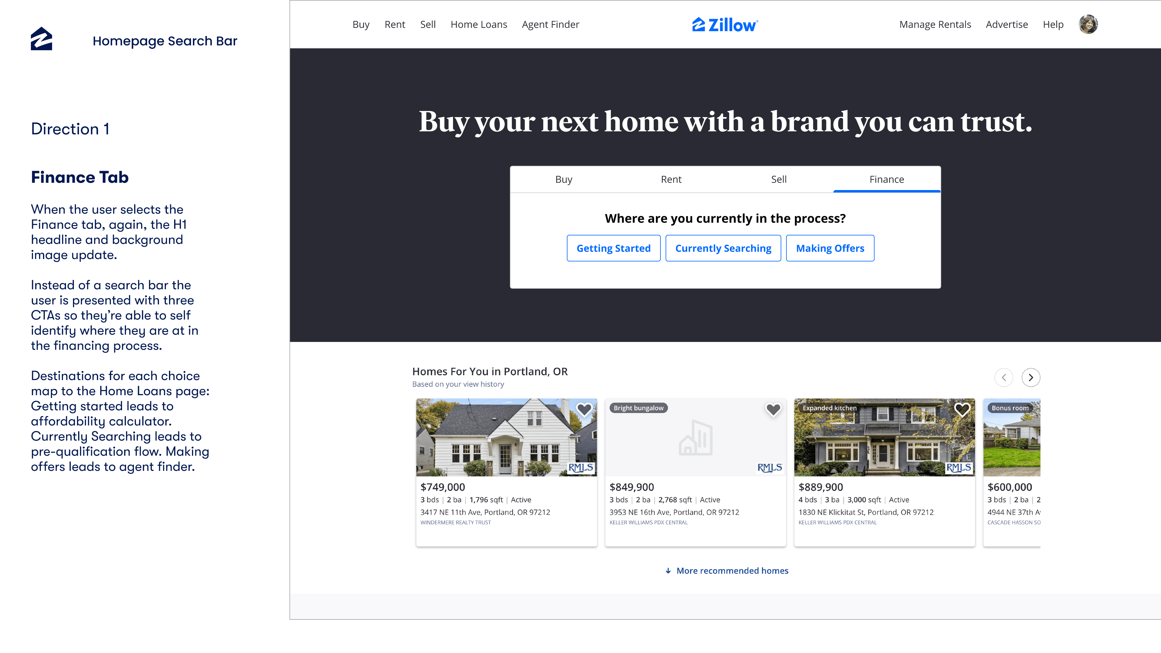
Direction 1: Get to Parity with Industry Norm
In this direction, we aimed to align Zillow's search functionality with industry standards by integrating rental and loan options seamlessly into the search bar. This approach ensures users can access comprehensive property information without leaving the platform, streamlining their search experience to match what they would expect from leading competitors.
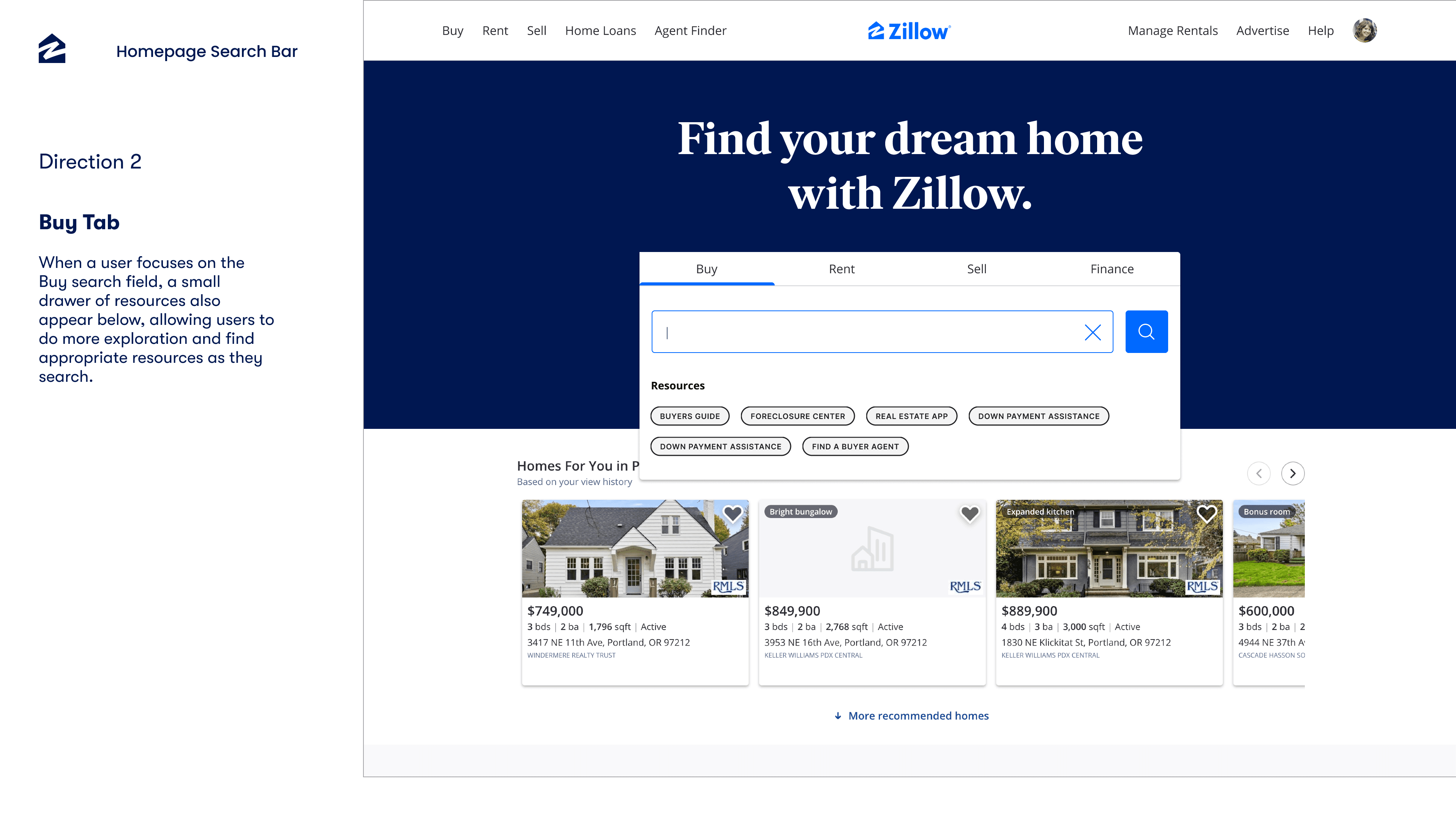
Direction 2: Up Level Key Information in a Simple, Minimal Way
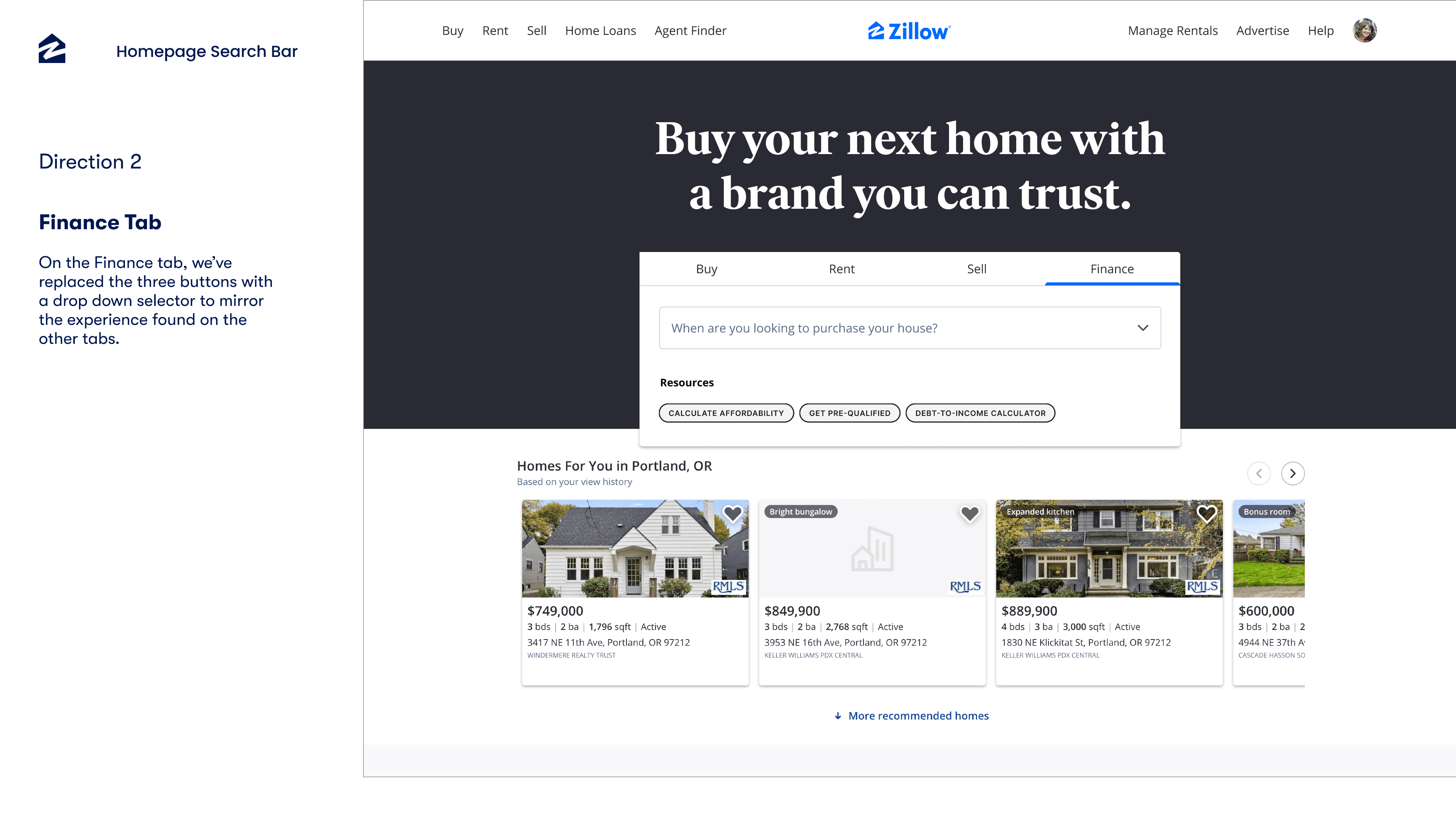
This direction focused on elevating essential rental and loan information within a clean and minimalistic interface. By incorporating subtle enhancements to the search bar, we made key details readily accessible without overwhelming the user, maintaining an intuitive and efficient search experience.
Direction 3: Up Level Key Information and Resources, with Maximum Visual Impact
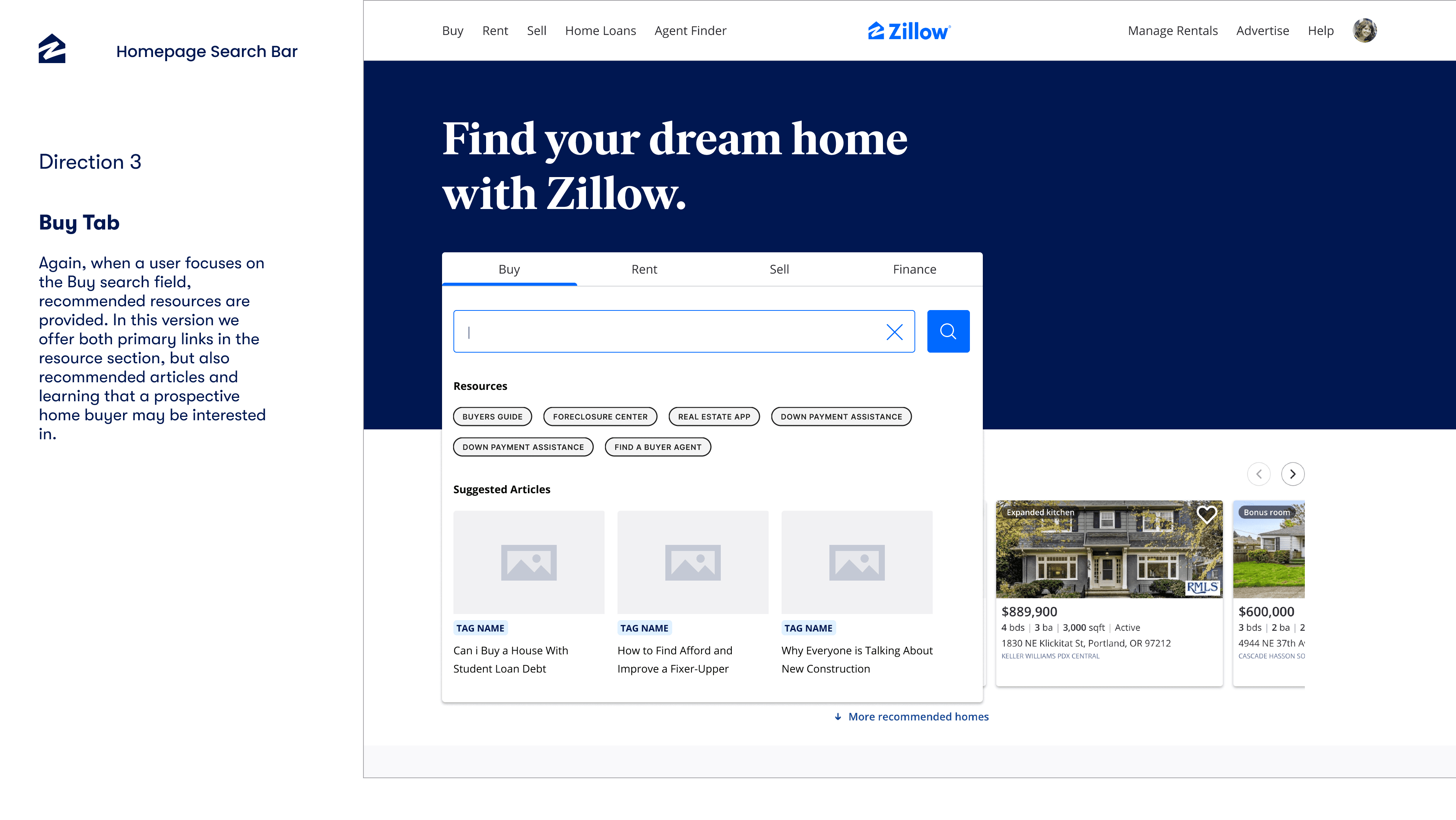
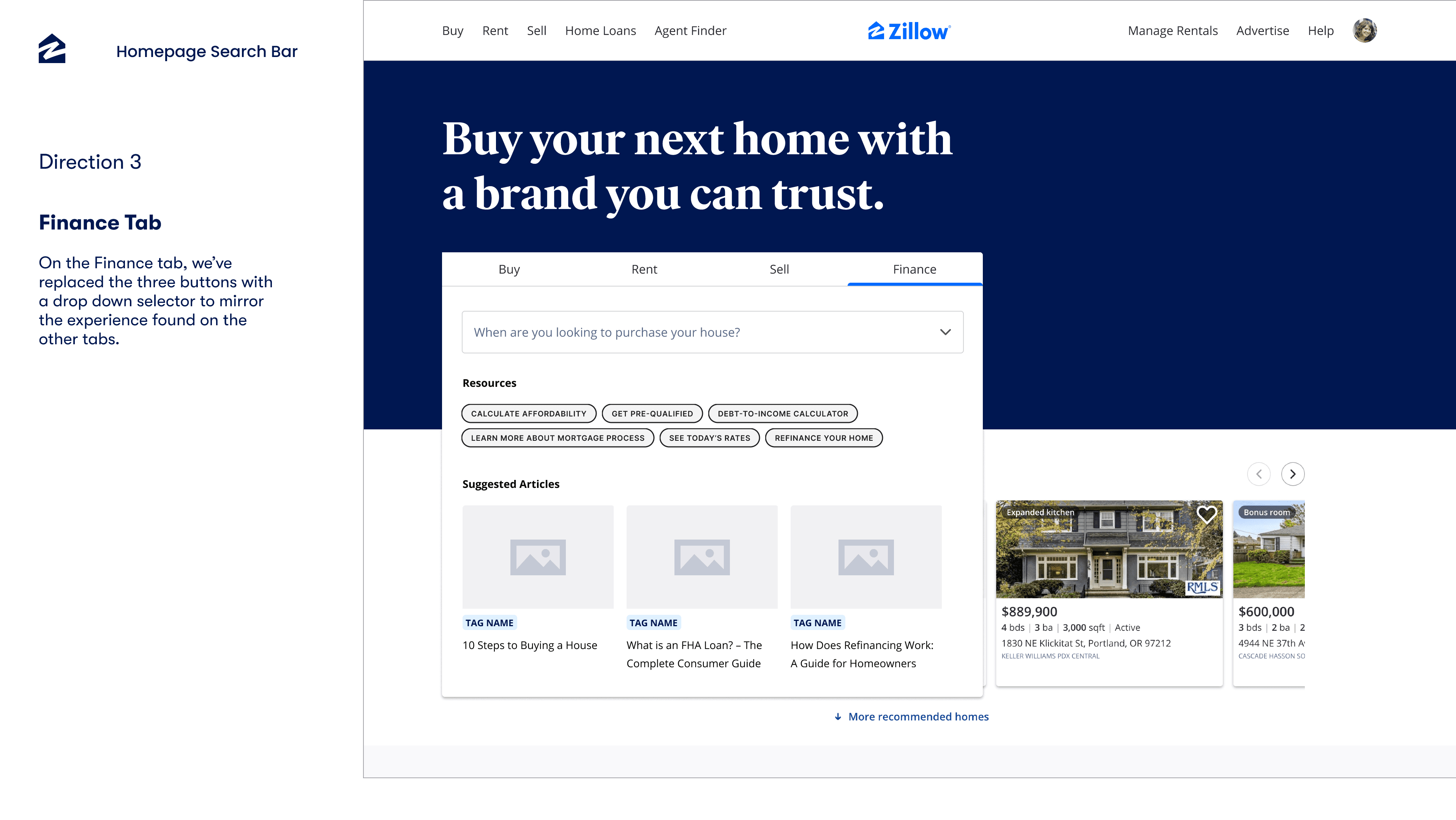
Our third direction took a bolder approach, integrating rental and loan options with striking visual elements to capture users' attention. This design not only provided comprehensive information but also highlighted resources and tools available on Zillow, creating a visually engaging and informative homepage search experience.
The Outcome
The internal research and design exploration process provided valuable insights and options for enhancing Zillow's search bar with loan options integration. Stakeholders were engaged throughout the process and empowered to make informed decisions regarding the preferred design option for implementation.
